
Some colors instantly make an outfit, makeup look, or hair shade feel more lively—but why do certain warm, bright shades seem to look especially harmonious together? The answer can often come down to your seasonal color palette.
The warm spring color palette is known for colors that feel sunny, fresh, warm, and energetic. Instead of relying on muted or overly cool shades, this palette brings together cheerful tones such as warm peach, coral, golden yellow, fresh green, and creamy ivory. These colors can be used across clothing, accessories, makeup, hair inspiration, and even nail looks.
The Color Story Behind Warm Spring
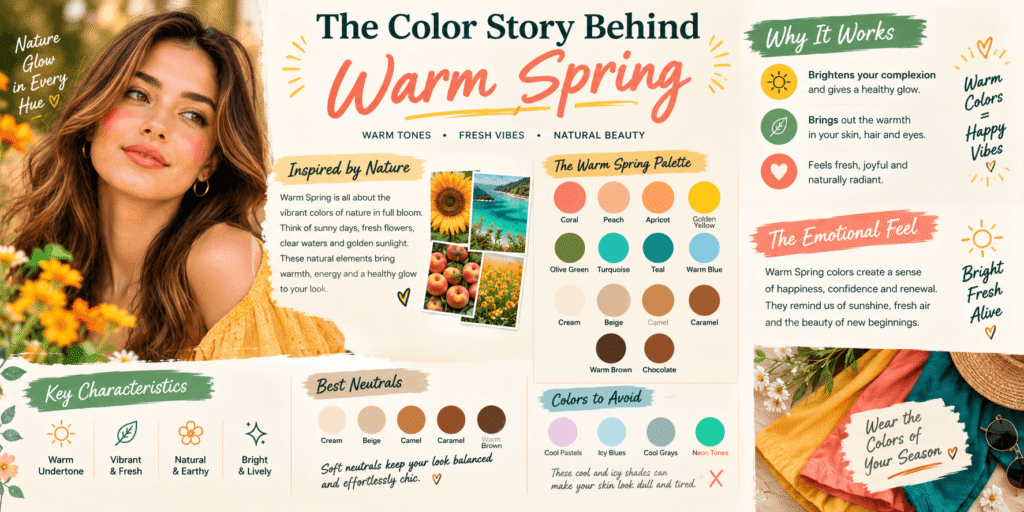
warm spring color palette sits within seasonal color analysis and is generally associated with a warm undertone, bright coloring, and a fresh overall appearance. The palette feels lighter and more energetic than many autumn-inspired combinations, while still maintaining a noticeable warmth. Think of the colors you might naturally associate with a sunny spring morning: warm blossoms, golden sunlight, fresh leaves, ripe fruit, and clear blue skies.
One of the easiest ways to understand a warm spring color palette is to focus on temperature and intensity together. Warmth matters, but so does brightness. A shade can be warm without necessarily feeling like a typical Warm Spring color if it is too muted, grayish, or deep. The most characteristic colors tend to have a clear, lively quality.
This is why shades such as warm coral, peach, apricot, tomato red, golden yellow, and fresh greens can work particularly well within this palette. Creamy neutrals can also provide balance without making the overall combination look dull.
The palette does not mean that you have to wear bright colors from head to toe. In fact, one of the easiest ways to make these shades wearable is to combine a brighter color with a warm neutral. A coral top with cream trousers, for example, can create a cheerful combination without feeling overwhelming. Similarly, a warm beige outfit can become more interesting with a golden-yellow accessory.
Another useful feature of this palette is its ability to create combinations that feel naturally coordinated. Warm peach can sit comfortably beside coral, while golden yellow can work with fresh green. These combinations can be mixed according to how bold or subtle you want your look to feel.
Shades That Bring the Palette to Life
warm spring color palette are often easiest to recognize when grouped into families. Warm pinks and reds can include coral, salmon, warm watermelon, and tomato-inspired shades. These colors have enough warmth to avoid looking icy or blue-based while still maintaining a fresh quality.
Yellow is another important part of the palette. Instead of very pale lemon or cool pastel yellow, think about sunny yellow, butter yellow, golden yellow, and warm marigold-inspired tones. These shades can add brightness to an otherwise neutral outfit and work particularly well as statement pieces.
Green can also be surprisingly versatile. Fresh leaf green, warm apple green, chartreuse-leaning shades, and lively olive variations can all contribute to a spring-inspired wardrobe. The goal is usually to choose greens that feel clear and warm rather than heavily gray or extremely deep.
For blue, warmer and clearer shades tend to work better than icy blue-gray tones. Turquoise, warm aqua, and certain bright teal shades can introduce contrast while still fitting the overall lively character of the palette.
Orange is another natural choice. Peach, apricot, warm tangerine, and coral-orange shades can create some of the most recognizable combinations associated with a warm spring color palette. They can be used in clothing, lipstick-inspired makeup choices, accessories, or small details when you want a look to feel brighter.
Neutrals are just as important as statement shades. Cream, warm ivory, camel, light tan, warm beige, and soft golden brown can help ground brighter colors. These neutrals are often easier to build everyday outfits around than stark black or very cool gray.
Building Everyday Outfits With Warm Spring Colors
A seasonal palette becomes much more useful when it works in everyday life. You do not need an entire wardrobe filled with bright shades. Starting with a few warm neutrals can give you a flexible foundation, then you can introduce stronger colors through tops, dresses, bags, shoes, scarves, jewelry, or other accessories.
For a simple everyday combination, warm ivory can act as the base while coral or peach provides the main color. If you prefer something more energetic, golden yellow can be paired with a fresh green accent. For a softer appearance, peach and cream can create a warm combination without becoming overly bold.
Denim can also be incorporated, but the exact shade matters if you want the entire outfit to stay within the palette. A clearer, warmer-looking blue can generally feel more harmonious than an extremely faded blue-gray. The same idea applies to accessories: warm metals and golden details can naturally complement the warmth of the overall color story.
Patterns can be used as well. Instead of choosing a pattern based only on whether you like its individual colors, look at the combination as a whole. A print containing coral, cream, golden yellow, and warm green can create a cohesive effect because the shades share similar warmth and brightness.
The beauty of a warm spring color palette is that it can be adjusted to different levels of personal style. Someone who loves colorful fashion can make coral, yellow, or green the center of an outfit. Someone who prefers minimal clothing can keep most pieces neutral and add just one lively shade.
Warm Spring Colors for Beauty and Makeup
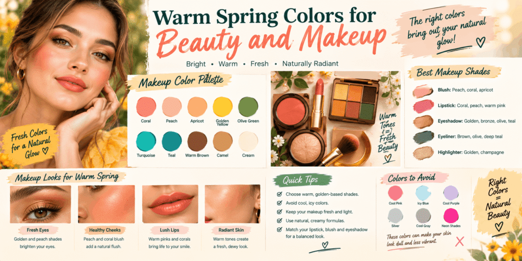
The same color principles can extend beyond clothing. Makeup shades can also be selected with warmth and brightness in mind. Warm peach, coral, apricot, and warm pink tones can create a fresh-looking color story, while creamy beige and golden tones can work as supporting shades.
For lips, warm coral, peachy pink, warm rose, and certain tomato-inspired reds can fit naturally into the palette. For cheeks, peach and coral-inspired shades can create a coordinated appearance. Eye makeup can introduce warm gold, bronze, peach, or softly defined brown tones.
However, seasonal color analysis should be treated as a style guide rather than a strict rulebook. Personal preference matters. You do not have to remove every cool color from your wardrobe simply because it falls outside a particular palette. The purpose is to understand which colors may create the visual effect you enjoy most.
Accessories can be an easy way to experiment before making bigger changes. A warm-toned bag, scarf, pair of earrings, or hair accessory can introduce the palette without requiring a complete wardrobe change.
Using Warm Spring Inspiration for Hair and Nails
Hair color and nail design can also borrow from the same warm, lively color family. Golden brown, honey-inspired shades, warm caramel, and other warm-looking tones can complement a spring-inspired aesthetic. The exact hair color that works for someone depends on their natural coloring and personal preference, so the palette is better used as inspiration than as a universal rule.
Nails offer even more freedom because you can experiment without changing your overall appearance. Peachy pink, coral, warm nude, creamy white, golden shimmer, and sunny yellow can all create cheerful combinations. A simple warm nude manicure with one coral accent nail can capture the feeling of the palette without becoming too colorful.
For a more noticeable design, warm peach can be combined with golden details, while coral and creamy white can create a fresh contrast. Small floral patterns can also work especially well because the colors naturally connect with the visual feeling of spring.
The important idea is consistency rather than perfection. When several elements of a look share similar warmth, even a simple outfit or beauty look can feel intentionally coordinated.
Creating Color Combinations That Feel Naturally Balanced
The real magic of a warm spring color palette appears when different shades are combined rather than worn separately. Because the palette includes warm and lively colors, even simple combinations can create a fresh and coordinated appearance. The easiest approach is to choose one noticeable shade and support it with one or two softer colors. For example, coral can become the main color while cream and warm beige keep the outfit balanced.
If you enjoy brighter looks, combinations such as golden yellow with fresh green or peach with warm turquoise can create a cheerful effect. These pairings feel energetic without requiring complicated styling. For a more subtle look, warm ivory, camel, peach, and soft coral can work together while keeping the overall appearance understated.
You can also use the same idea when choosing accessories. A neutral outfit can instantly feel more connected to the palette with a coral handbag, golden jewelry, peach scarf, or warm-colored shoes. This makes it possible to experiment with seasonal colors without replacing your entire wardrobe.
Another useful trick is to pay attention to brightness. Warm colors do not automatically belong to Warm Spring. A color may be warm but too dusty, gray, or deep to create the fresh quality associated with this palette. When choosing between similar shades, the clearer and more lively option will often feel closer to the palette’s overall character.
The Neutrals That Keep Bright Shades Wearable
Bright colors are exciting, but warm neutrals make them much easier to use every day. Cream and warm ivory can replace stark white when you want a softer contrast. Warm beige and camel can provide a dependable foundation for brighter tops, dresses, and accessories, while light golden brown can add depth without making the outfit feel heavy.
These neutrals can also be layered together. A warm beige base with a cream layer and a small coral accent can create a polished outfit without relying on several strong colors. This approach is particularly useful if you are interested in the warm spring color palette but normally prefer simple or minimalist clothing.
Black and cool charcoal can still be worn because personal style does not need to follow seasonal color rules perfectly. However, if you want a look that strongly reflects the palette, warmer neutrals can often create a more seamless connection between your clothing and brighter shades.
Warm Spring Makeup Ideas for a Fresh Look
The beauty side of a warm spring color palette can be just as versatile as the fashion side. Warm peach, coral, apricot, golden beige, and warm pink can create a cohesive makeup color story. Rather than making every part of the look bright, you can choose one feature color and keep the rest softer.
For example, a peach or coral-inspired cheek color can become the main accent while the rest of the makeup stays neutral. Warm brown and golden tones can also work nicely when you want definition without creating an overly dramatic contrast. Lip colors inspired by coral, peachy pink, warm rose, and tomato red can provide different levels of intensity.
For a softer everyday appearance, creamy beige and peach can create a subtle combination. When you want something more noticeable, coral or warm red can become the statement shade. The important thing is that makeup should remain a personal choice; seasonal palettes are useful for inspiration, not a strict list of colors that you must wear.
Hair, Jewelry, and Small Details Matter Too
Your clothing does not have to carry the entire color story. Small details can make a surprising difference. Gold-toned jewelry can complement the warmth of the palette, while accessories in coral, peach, yellow, turquoise, or fresh green can introduce brighter shades in manageable ways.
Hair inspiration can also follow the same warm direction. Honey, caramel, golden brown, and other warm-looking shades can fit naturally with the palette’s aesthetic. However, changing your hair color is a personal decision, and a seasonal palette should be used as inspiration rather than a reason to make a major change.
Nails provide an especially easy place to experiment. A creamy nude base with peach details, a coral French tip, golden accents, or a warm pink design can bring the palette into a beauty routine without requiring a dramatic change. Even a simple manicure can feel more intentional when the colors connect with the rest of your look.
Colors That May Feel Less Connected to the Palette
Understanding less harmonious colors can be just as useful as knowing which shades to choose. Extremely cool, icy colors may create a stronger contrast against the warmth and brightness associated with Warm Spring. Very dusty shades can also make the overall effect feel less fresh, particularly when compared with clearer alternatives.
Deep, heavily muted colors may have a more autumnal or winter-inspired appearance. That does not mean they are forbidden. Personal style is not a test that can be passed or failed. If you love a certain color, you can absolutely wear it. Seasonal color analysis simply helps explain why some combinations may feel more naturally connected than others.
When a color feels slightly too cool or muted, accessories can help bring warmth back into the overall look. A warm-toned bag, gold jewelry, or peachy makeup accent can create a bridge between the chosen shade and the rest of the outfit.
Making the Palette Work for Different Personal Styles
One of the biggest misconceptions about a warm spring color palette is that it requires a colorful wardrobe. It does not. The same palette can work for someone who loves minimal outfits, someone who enjoys romantic fashion, or someone who prefers bold statement pieces.
A minimalist can focus on cream, warm beige, camel, and soft brown, adding one brighter color at a time. Someone who enjoys feminine styling might combine peach, coral, warm pink, and creamy ivory. A more adventurous dresser can experiment with golden yellow, turquoise, fresh green, and orange-inspired shades.
You can also adjust the palette according to the occasion. Everyday outfits can use softer neutrals and one accent shade, while parties or special events can make brighter colors more prominent. This flexibility is what makes seasonal color analysis useful beyond a single trend.
A Simple Way to Start Using Warm Spring Colors
You do not need to buy new clothes or completely change your beauty routine to explore the palette. Start by identifying colors you already own that resemble warm peach, coral, cream, golden yellow, fresh green, or warm turquoise. Notice which combinations you naturally enjoy wearing.
Next, try introducing one new shade at a time. If coral feels comfortable, pair it with cream. If golden yellow catches your attention, try it with warm beige. If you like fresh green, balance it with an ivory or camel neutral.
Over time, you will begin to notice which combinations feel most natural to your personal style. This is more useful than trying to follow a fixed color chart because your preferences remain part of the process.
Final Thoughts
The warm spring color palette offers an easy way to make fashion and beauty choices feel brighter, warmer, and more coordinated. Its combination of clear colors and warm neutrals gives you plenty of room to create anything from a subtle everyday look to a bold statement outfit.
The most important part is not following the palette perfectly. Instead, use it as a starting point for discovering combinations you genuinely enjoy. Experiment with coral, peach, golden yellow, fresh green, warm turquoise, creamy ivory, and warm beige, then adjust the intensity according to your personal style.
Whether you bring the palette into your clothes, makeup, accessories, hair inspiration, or nails, small changes can make a noticeable difference. You can keep your existing wardrobe, add a few accent shades, and gradually discover which colors make your overall style feel the most fresh and expressive.




One Comment